*This article applies to the Classic Woobox campaign templates found at the bottom of the “New Site” creation screen.
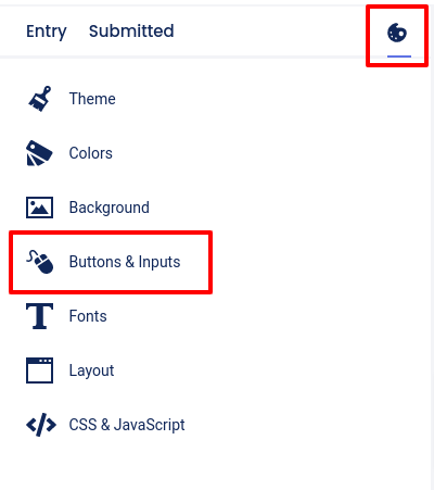
In the Design section, you can choose from 3 different button styles. Just click the “Painter’s Palette” icon, then click Buttons and Inputs.
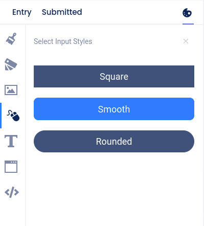
Then choose one of the button styles from the secondary panel that opens to the right.
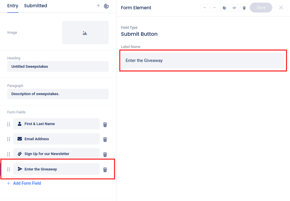
To change the dialogue or button text, click on that field in the Form Fields section on the Entry page.
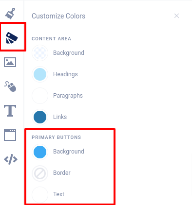
Button background, border, and text colors are adjusted in the Colors -> Primary Buttons section.